Monday, October 06, 2008

Antisocial networking


Once upon a time, Dillon and Kloe were close. Sadly though, it was destined not to last. Things went wrong. Things fell apart.

The problem was, Dillon became convinced that Kloe was two-timing him. And it wasn't just a one-off — Dillon got it into his lovestruck young head that Kloe was cheating on him again and again. Looking back, he told himself he'd seen the warning signs early on, after that time she'd given a lapdance to a 40 year old.

Could it be true? Did Kloe really betray him? To be honest, it doesn't matter whether or not it was true. The point is, Dillon believed it. And with that, the damage was done. Poor Dillon's heart was broken. Oh dear.

Time is a great healer though, and broken hearts get better, eventually. Just ask Dillon. That was then, but this is now. Dillon is officially over Kloe. Oh yes. Kloe is history. Dillon has achieved closure. He has moved on. What's more, Dillon is back in the game. He is up for a new relationship. He is single and looking. He is, as he puts it, down for whatever. A word of warning though — if you're trying to impress Dillon, don't show him a big spider. He doesn't like big spiders. Big spiders are a strict no-no.

But how do we know all this? How can we possibly deduce so much information from just a few scrawled words on the tiled wall of a row of railway arches lining Edinburgh's Abbeyhill, close to the Scottish Parliament? Simple. Because we live in an era of freely available social networking sites. Because few people seem to stop and think just how much personal information they give away online. Because there is little privacy any more. Because it's way too easy and way too tempting to air your dirty laundry in public. Because, for many people — and not just tempestuous, headstrong youngsters — self-restraint and common sense are things of the past. And because Google is such a frighteningly powerful tool.

Thanks for the insight, Dillon Good luck out there. Hope things work out better for you next time. Just don't forget to keep us posted, OK?

Tuesday, September 09, 2008

Hurry up, the pips are going

The Great British telephone box is under threat. Once a widely used item of street furniture and a familiar part of our landscape, they're disappearing fast and heading towards oblivion. There's no prize for guessing why - the proliferation of mobile telephones has triggered a revolution in inter-personal communication.

Let's crunch some numbers. As recently as 2002, Britain had 95,000 phone boxes - an all-time high. By mid-2008, that figure had decreased by well over 30,000, and more seem certain to be lost. Of the 61,000 or so kiosks that remain, close to 60 per cent are unprofitable. BT says payphone usage has dipped by just over 50 per cent since 2006, and the number of calls made from phone boxes are declining by 20 per cent year-on-year. On average, 6000 public telephones are used to make less than one call a month. Grim sums.

Faced with diminishing call revenue from kiosks and the ongoing expense of keeping them clean and in good working order - well, they are something of a vandal magnet, aren't they? - BT recently announced plans to remove yet more under-used phone boxes from our streets. 8,700 are currently lined up to be decommissioned, including many iconic red telephone boxes, a symbol of Britain recognised throughout the world. Sad, innit?

Phone boxes have many other uses apart from facilitating phone calls though. They can act as handy public toilets - venture inside one and have a sniff for some eyewatering proof - and they have long been used to tout for business as well.

Kiosks can also double as venues for impromptu get-togethers for the homeless and dispossessed during spells on inclement weather, as demonstrated by the post-party debris in the image at the top of this posting, taken on East Crosscauseway in Edinburgh city centre. That same picture also shows how the interior of phone boxes offer an ideal canvas for imaginative street artists to indulge in some high-profile creativity. Here's another example, taken outside the Pleasance in Edinburgh:


Other artists prefer to subtly amend adverts on the exterior of kiosks, elevating bland ads into something more interesting, as illustrated in the following examples. The first was spotted on North High Street in Musselburgh:


Attention should be drawn here to the use of an unusual method. Bold scratching like this is rarely seen.

The artist responsible for our final example has chosen to make a bombshell allegation about an all-American icon, the late Colonel Sanders:


Oh dear. Let's tactfully ignore the contentious and unsubstantiated claim made in that one.

It would be tragic if these public canvasses were to disappear from the streets of Britain completely, but there is a glimmer of hope for the future. BT recently announced plans for a scheme that would allow councils to sponsor local phone boxes for a nominal fee, so they can be retained for posterity. If the plan goes ahead, kiosks would stand as permanent reminders of a bygone age - the pre-mobile era. Better still, they could continue to be utilised by aspiring artists for generations to come.

If that's not an incentive to save them, what is?

Wednesday, June 04, 2008

Wakey wakey


Rising sleepy-eyed from a seven-month slumber, The Filthy Pen yawns, stretches, and wonders if it might have overslept just a wee bit. Not to worry. Let's pull out our allegorical finger, pull up our metaphorical socks, and get on the end of it.

For TFP's comeback posting, we've opted for tradition and simplicity in the form of a series of images currently on show along a short stretch of Edinburgh's city centre. The series consists of four penises, which begin on Waverley Bridge, above, and finish midway along nearby Cockburn Street, below - a route that takes little more than 60 seconds to walk.

It looks as if someone's been having fun with their chalk. Or maybe not. Perhaps the handiwork represents the efforts of more than just a solo artist. Take a moment to study each individual image, and you'll see that the subjects come at the viewer from all angles, and in an array of styles.


Could it have been an outing by students from the renowned Edinburgh College of Art, working en masse as part of an assignment to liven up the city with a series of al fresco micro-tableaux?

Art is all about interpretation. First, there's interpretation on the part of the artist, in terms of their influences, their choice of subject matter, and how they use their raw materials at their creative disposal. Then there's the interpretation on the part of the viewer - in other words, how the audience reacts to the art they're confronted with, and what they feel it says to them about the world around them and their own place within it. And it's all subjective. There's no good or bad, or right or wrong. It's a personal thing. Viewer A loathes it, Viewer B loves it.

So, are you Viewer A or Viewer B?

Monday, November 19, 2007

Too many eggs

Ah, the exuberance of youth. Fizzing with teenage hormones and full of boundless beans, it feels like there's nothing you couldn't do - if only you could be bothered to set your mind to it.

When you're young, the world is your metaphorical oyster and you can choose to fritter away your time in any number of exciting and productive ways. You could irritate fellow bus users by loudly playing bland R'n'B through the inadequate speaker on your mobile phone. Perhaps you'd like to congregate with some pals and lurk about in the street, unnerving passers-by. Or maybe you'll opt to make your mark on society in the literal sense, with the aid of a Magic Marker.

If you choose the latter, be careful - it's easy to get carried away and over-egg your graffiti pudding. Take the culprit responsible for the blue-inked penwork in today's example, an East Lothian District Council notice on the wall of a public car park in Musselburgh. If you like your puddings over-egged, this one's for you.

If the writer had crossed out games and added the letter s to the word ball, the handiwork could've become a sly dig at a lacklustre, nondescript council. Another option was to simply write the words in my trousers beneath the official message on the otherwise unaltered sign, turning it into a self-deprecating and amusing joke about the writer's lack of testicles.

Instead though, swept up in the excitement of trying to get the idea across, a foolhardy attempt has been made to combine both options. The resulting muddle just doesn't make sense.

What a wasted opportunity. What a disappointing mess. Very poor.

Tuesday, September 11, 2007

Eleven Nine

September 11 2001. Four commercial airliners. 19 hijackers. Almost 3,000 dead and missing. The emergence of Osama bin Laden and the rise of al-Qaeda. The catalyst for the war on terror. Part of the excuse for the eventual invasion of Iraq. A growing death toll.

Do you remember where you were when you first heard the shocking news filtering through? The chances are you do. And though we can only guess where one I.L.McKinnes was on that fateful day in 2001, we certainly know where he or she was 14 years previously, on September 11 1987 - standing at the foot of a flight of steps off Montrose Terrace in Edinburgh, a stone's throw from the junction of Easter Road and London Road. And we know what they were doing - dragging a cheeky finger through some wet cement rendering on a wall to leave a profound message for future generations to enjoy.

A freshly-applied patch of wet cement holds the same sort of attraction for a graffitist that an open pot of jam holds for a wasp. It's impossible to ignore. It's crying out for some close attention. So imagine the buzz of excitement I.L. must have felt at the sight of this newly-rendered wall. What an opportunity for self-expression. What a glorious chance to unleash some free-thinking, leftfield creativity. And on completion, there was even time to sign and date it. Stylish.

Let's put a shout out, as dedication-seekers say on radio show call-ins, to the enigmatic I.L.McKinnes. Big up. Top work. Nice slogan. Happy 20th anniversary.

Monday, August 06, 2007

A bunch of fives

British gays have been having a right old knees-up. They've had their party hats on. They've had their blow-ticklers out. They've cut their cake. They've popped their corks.

The cause of their celebration is the 40th anniversary this summer of the decriminalisation of homosexuality. Before the Sexual Offences Act 1967 came into effect, the UK's homosexual community was restricted to low-key cruising and furtive cottaging. The threat of prosecution was constant. Victimisation and blackmail were rife. Once the new law came into effect, it was all a little less low-key, and not quite as furtive. And the bottom dropped out the blackmail market.

Gay rights campaigners still have their hands full though. Their current battleground is the use of the word 'gay'. Once it meant cheerful and carefree, then it evolved to mean homosexual, and became a positive replacement for the commonly-used 'poof', which was something of a derogatory term.

In recent years, the meaning of gay has changed once again. It is now often used as a general, multi-purpose put-down to dismiss anything considered to be inferior, undesirable, bland, embarrassing or a bit rubbish. Your ringtone is gay. Your car is gay. Your nan is gay. Some homosexuals don't like their word being used in this way. They claim it has homophobic undertones. Their opponents disagree. Don't be so gay about it, they say.

Graffiti artists have no qualms about the language they use. They'll happily chalk anything on a wall to make a point, using whatever phraseology they fancy. The pictures in this multi-image posting - a bunch of fives, if you like - illustrates this theory. Poof, gay... it's all fair game to them.

The first image, seen above, was sent in by Filthy Pen correspondent Emma Goodman, who noticed the defaced sign on an East Lothian industrial estate. The job looks to have been carried out with a high degree of care and attention to detail. Very nice. Thanks for that, Emma.

The second entry hails from Leith Walk in Edinburgh, where it was spotted adorning a pedestrian crossing - for no obvious reason - by regular TFP correspondent Nicola Rainey.

It's a rough and ready piece of work, and appears to have been etched or scratched rather than written. The slightly blurry mobile phone camera shot captures its old-skool spirit perfectly. Good spot Nicola.

Next, we're off to Grimsby, a town which has more than its fair share of colourful graffiti adorning its streets. This piece - faint, but legible - is written in green crayon on the exterior wall of a newsagents in the town centre.

Perhaps the author has what is often referred to as "issues" with the store, or with the storekeeper. Or maybe it's intended as a comment on the shop's top-shelf reading material.

By bizarre coincidence, almost 300 miles north, in the sprawling Dumbiedykes housing estate close to Edinburgh city centre, we find another green-crayoned slogan.

Whether the message is a reference to a person named Telford or the Shropshire town is anyone's guess. And what is it about that colour of crayon that makes it so attractive to graffiti artists?

The fifth and final image comes from that great graffiti canvas, the wall of a public toilet. This particular example was seen in the men's facilities at the Meadows Bar in Buccleuch Street, Edinburgh.

It seems to have been freshly-etched when this picture was taken - you can still see the flaky paint on the lettering - but that doesn't help us decide whether the slogan is a theory about Ray, or a rumour, or a confession.

Or maybe the culprit just thinks he's a bit rubbish.

Tuesday, July 31, 2007

Myths and mysteries

Past postings on The Filthy Pen have pondered on graffiti's history and origins - postings such as this one and that one, should you feel like looking them up. From these, we have learned that graffiti has its roots at the very dawn of mankind, and was a favoured form of free expression in the days of the mighty Roman Empire.

Today's graffiti can be seen on a sea wall along the waterfront at Portobello, a quaint town on the edge of the Scottish capital known as 'Edinburgh's seaside'. A large-scale work, this daubing seems to offer a reverential nod towards another colourful era of history - the ancient Greeks. Come on, look at that image; surely there's a connection here?

Greek mythology is littered with powerful gods and goddesses, legendary heroes and heroines, terrifying and fabulous creatures, gifted figures and tortured souls. If we look hard enough, perhaps we'll find what we're searching for.

Consider Atlas. He was condemned by Zeus to carry the impossible weight of all the heavens on his mighty back. What a punishment. Echo, a nymph who fell foul of Hera, was punished too. Hera was Queen of Olympus and wife of Zeus, and she put a curse on poor Echo so she could only repeat the words of others, and never speak for herself again.

What about Dionysus? The Greek god of wine, Dionysus was an inveterate lover of the sauce of the grape. It was he who granted Midas his wish to turn whatever he touched into gold. Midas first found his newly-acquired ability a gift, but it turned out to be a tragic curse. He could not eat or drink, and when he touched his daughter, she too turned to gold. Disaster.

Then of course there's Pan, the Greek god of shepherds and flocks. Half-man, half-goat, Pan is said to have had the power to put into the hearts of men a feeling of sudden fear - the gift of panic. He was lecherous old goat too. He had Echo torn to pieces when she spurned him. Ouch.

Such gripping tales and potted biographies are all very entertaining, but they're not much help to us in our quest. But what about Pegasus? The offspring of Medusa and Poseidon, the Greek god of the sea, Pegasus was no ordinary old nag - he had the gift of flight. Is our graffiti's author making a cryptic claim to be hung like a winged horse? It's a possibility. Either way, it seems our trail is getting warmer.

Now we get to Hermes. A messenger of the gods, Hermes was a psychopomp - someone responsible for guiding the souls of the dead to the underworld. To help him in his task, he had winged sandals and a winged helmet - the sort worn on the head, that is. Could our artist be hinting that Hermes sported wings elsewhere too? Libraries were visited, dusty books were pulled from dustier shelves and fragile pages were carefully turned, but no documentary evidence to support such a bold theory came to light. What a pity.

So there you have it; another unanswered riddle. The Winged Penis of Portobello remains a mystery. And we came so close to cracking it, didn't we.

Monday, July 23, 2007

Grow up Sean

On The Filthy Pen's trawl through the cheeky doodles and scrawled messages that decorate the UK's public spaces, there's one aspect of graffiti that so far we've barely scratched the surface of - the murky realm of personal attacks and public vendettas.

While jibes, digs and insults form a key part of much graffiti, examples where the victim's full name is utilised are much rarer. Over the last few months though, an impressive collection of such images has been assembled here, and now seems as good a time as any to start featuring them. Assorted forthcoming posts will highlight a diverse array of such hyper-personal pieces. Let's air some grievances. Let's get things out in the open.

To start the ball rolling, here's a piece of graffiti from Victoria Street in Grimsby. It was spotted on the external wall of Argos, adjacent to the store's entrance. The site is unlikely to have been selected at random, and was presumably chosen because it's a favourite shopping spot of the writing's target, Sean McNally.

As you may have noticed, there is a strong trend among today's young British males to sport ostentatious jewellery. For many, Argos is their preferred shop as it offers a wide range of fashionable and attractive pieces at reasonable prices. Perhaps the graffiti's author placed their message there in the hope it would catch Sean's eye as he ventured in to peruse the latest edition of the chunky Argos catalogue, before checking his chosen item's availability on the user-friendly computerised stock system and - providing they'd not already sold out - making his purchase.

What might Sean have selected? There's much to choose from. He might have decided on a tasteful ring, or a modest pendant, or a discreet earring. Such a wealth of choices.

We can also see from the same picture that Bryony and Tod, whoever they may be, sadly appear to have ended their romance. Bryony, it seems, is no longer “4” Tod. Oh dear. Maybe Bryony scribbled over her own name after a tiff, or perhaps Tod attacked it with a marker pen after a falling-out. Or it could be that a jealous, vindictive Sean McNally was responsible for defacing it, leading in turn to the graffitied retort from one of the still-happy couple in a bid to cut him down to size and highlight his childishness in trying to come between them. Maybe Bryony had previously dumped Sean for Tod, leading Sean to deface their public declaration of love as a method of petty revenge.

There are so many options here. You will have to decide for yourself what it is that makes Sean so immature, and whether Bryony and Tod's romance is on or off. Consider it a sort of real-life soap opera, starring a young Grimsby cast – an earthier alternative to Hollyoaks, if you like. Use your imagination. Plot out a storyline.

Thursday, July 12, 2007

The silversmith

With this piece of work, what you see is what you get. There's no ironic sub-text here. There's little to analyse or deconstruct. It gets straight to the point, and the point is simple: overwhelmed by an irresistible urge to spray the word knob in silver paint on the shutter of a lock-up on Calton Road in Edinburgh, the perpetrator succumbed. Word sprayed, point made, job done.

The technique here is admirable. Look at the lettering. Little if any paint has run. Whoever carried this out handled their mission skilfully. It seems they're no stranger to such tasks. They've done this before. They have form. They've got previous.

If they knew what they were doing, they may have gone so far as to use some protection. Something along the lines of a spray vapour respiratory mask, perhaps. Wearing one would greatly reduce the risk of inhaling the tiny droplets of paint that are dispersed into the air when the nozzle of the aerosol is pressed. They may be tiny, but they can be dangerous. And, if inhaled in large enough doses, over a long period of time, possibly even carcinogenic. An experienced sprayer would see it as just another risk though. Occupational hazard. Comes with the territory.

Mask or no mask, we do know that at least one of the instructions on the spray can was followed to the letter - the product was used in a well-ventilated area. You can't get better ventilation than using it al fresco, can you?

Monday, July 09, 2007

Smoke-free Britain

Anyone old enough to remember the Community Charge may also recall that it was imposed on the people of Scotland a full year before it was palmed off on our neighbours south of the border. Commonly referred to as the Poll Tax, it was perhaps the most loathed piece of legislation to be introduced - or, to put it another way, flung at the public, in the same way that monkeys fling their filth at visitors to the zoo - during the Thatcher era. Boy, was she unpopular up here. Still is too. Just wait until she dies. There'll be dancing in the streets.

More recently, another piece of legislation was introduced in Scotland before it made it onto England's statute books - the ban on smoking in enclosed public places. This time though, instead of it being thrust upon us by Westminster, it was Scotland's own parliament that brought it in. Wales and Northern Ireland went on to take similar decisions, and England finally followed suit when legislation came into effect there on 1 July 2007, completing a UK-wide ban.

It has now been 16 months since the anti-smoking legislation's arrival here. It still invokes ire among a sizeable chunk of Scotland's population, as today's piece of signage defacement illustrates. Written on a reminder poster at the Royal Mail delivery office in Musselburgh, it's a simple piece of graffiti that utilises a nice piece of Scottish slang.

For anyone down south who's unfamiliar with its meaning, a fine definition of baw along with some examples of its potential uses can be viewed here. Go on - learn it, and use it.

Wednesday, May 30, 2007

The hat-trick of delights


Well well well, haven't the bored teens here been busy? Three little gems. A hat-trick of delights. Let's take a closer look at them, one by one.


This main piece is a nice try, but it's ultimately flawed and almost certainly untrue. The claim regarding the enjoyment of sex with poultry is unlikely to be a genuine confession by a genuine idiot, and is probably just a comedic device for the entertainment of the culprit's friends. The novelty spelling is a nice touch though. But let's shift our attention to those black-inked declarations sharing its space.


Although Jess can be a name for boys as well as girls, the use of the inflammatory term sweaty slag infers that this particular Jess is female. It's certainly a colourful enough piece of libel, though without knowing Jess personally we cannot tell how accurate the comment is. Now, what about this third piece of graffiti, sitting just above it?


What a fine insult gormo is. It contains many of the plus points that an effective piece of verbal disparagement needs. It's simple, it's pithy, it's memorable, and it's derived from a longer word, meaning it's a textbook example of creative slang. In short, it's a good call. There's nothing gormless about it.

Gormo is a word that could easily pass into wider usage. Think of its potential applications. It could be aimed loudly at a dozy colleague, or muttered in the vague direction of a mismanaging manager at work. It could be spat ruthlessly at a slovenly pensioner as they fiddle with their small change, holding up the queue at a supermarket checkout or at a bus stop in the rain. Or the lead set by the perpetrator of the example seen above could be followed, and it could be marker-penned onto a telecommunications junction box, for passers-by to enjoy.

The image was captured in the spring of 2007, at the start of a footpath that takes walkers past a previously-featured piece of quality nonsense, which can be revisited here if you're curious.

So much choice graffiti, and all within such a small area. What are the chances of that happening?

Thursday, April 12, 2007

A thing of beauty is a joy forever

Sometimes, as you amble through life while happily minding your own business, you're hit by something that stops you dead in your tracks and leaves you winded, like a punch in the solar plexus.

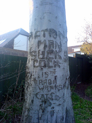
Filthy Pen correspondent Stuart Farquhar knows exactly how such a wallop feels. One afternoon, after viewing a house in Polmont, just east of the Scottish town of Falkirk, he wandered away from the property to see what the surrounding area was like. Spotting what appeared to be a message written on a tree, he moved a little closer in order to read it. What he saw stunned him. He could hardly believe his eyes.

What an astonishing sight. And what a fantastically multi-layered piece of work. As Stuart himself writes in the covering note submitted with his image: “The craftsmanship is to be commended, and the job must've taken at least 20 minutes to complete. It is a stunning amalgam of nature and sweary word. God knows when it was hewn - perhaps it was 15 years ago and it has grown with the tree? ... The truth is perhaps as unknowable as the motivation behind the message.”

With the aid of that trusty researchers' tool Google (other search engines are available) it can be ascertained that the 15th (Scottish) Battalion Parachute Regiment, to give it its full name, was founded in 1947 as a Territorial Army unit by “the legendary Alastair Pearson CB, DSO and three bars, MC, TD”. It was based in Glasgow, with units and companies in Aberdeen, Dundee, Perth and Edinburgh.

In its time, 15 Para saw action and adventure. It was also touched by tragedy. On the night of 11 September 1974, while on a NATO exercise in Germany, five of its members drowned when freak wind patterns during a parachute jump caused them to drift off course and land in the Kiel Canal. As well as pathos, there were stirring feats of derring-do; just a few months before the Kiel catastrophe, for example, one lucky parachutist had been saved from certain death when he was grabbed by another in mid-air after his chute failed to open. Heroic Boy's Own stuff indeed.

After a long and distinguished service record, 15 Para ceased to exist in 1993. It was disbanded as part of the reorganisation of the British armed forces following the end of the Cold War, a victim of the peace dividend. Based on this information, it would appear that Stuart's casual guess as to the age of the carvings is perhaps more accurate than he might have imagined.

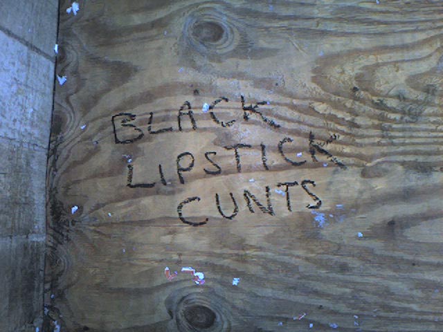
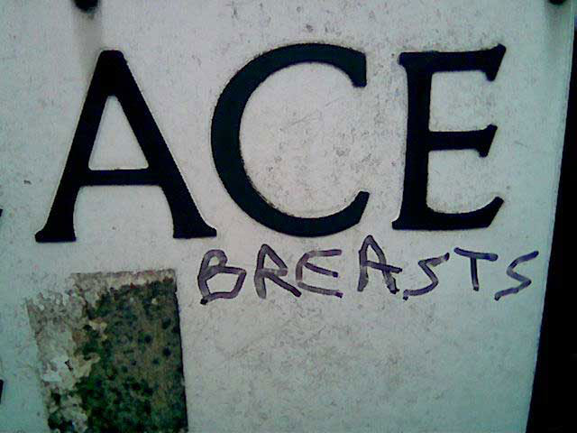
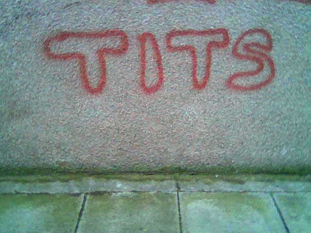
Enough of the history though. Let's propose a bold theory here. The Territorial Army, despite their excellent work and unstinting professionalism, are often derided by outsiders as being little more than a grown-up version of children playing at being real soldiers. The first piece of graffiti, which claims that Action Man practices fellatio, is therefore unlikely to refer to the popular boys' toy. Instead, it's probably a disparaging comment about a particular member of the Territorial Army who lived in the locale. Sticking with this theory, we can deduce that the second piece of work is likely to refer to that same individual member of 15 Para.

We can only imagine what such a distinguished figure as Alastair Pearson, his highly-polished medals glinting in the sunlight, would have made of one of his creation's soldiers being branded - to put it in office-safe firewall-friendly terms - a sausage-noshing feline fiddler.

What level of truth lies behind these tree-carved statements? Was the target an innocent victim of gossip, innuendo and hearsay, spread by neighbours he thought were his friends? Are the accusations based on fact? Was Polmont once rocked by the behaviour of a part-time troop living in its midst? Was a family pet really given a special tickle by a man in uniform? We can only wonder.

Leaving the moral issues behind, in aesthetic terms the level of dedication and effort that went into creating this work is nothing short of outstanding. Over the years, the tree has grown and the carving has swollen, but the inscriptions remain legible. As if aware of the lasting legacy of their work, this was no swift scrape with a penknife. This was carried out with surgical precision. As Stuart rightly pointed out, it must have taken ages to complete.

Yet despite running the risk of being apprehended mid-chisel, the perpetrator kept their head. Not only was the quality of workmanship maintained, it actually improved as the job progressed - note that final pointed A in CATS, compared to the earlier flat-topped lettering. That's the mark of a true craftsman, driven on by the urge to surpass a previous effort and expand their skills base. Marvellous. Hats off to whoever it was in the dim and distant past who carried this out. And the same goes for Stuart, for taking the time to send the picture in. Respeck.

The Filthy Pen's mission to collect and present some of the finest examples of graffiti found littering our landscape has been suffering from the digital equivalent of a gammy leg lately. It's purposeful cyberstride has deteriorated into a virtual limping gait, and this is its first posting in a shameful 10 weeks. The arrival of the inspirational image supplied by Stuart has injected some much-needed vim and vigour back into the project though.

With an ever-increasing collection of images stockpiled in TFP's files - a great many of them submitted by eager correspondents and virtually all worthy of exposure - here's to a glorious second wind. May it blow long and gustily.

Monday, January 29, 2007

Plum sauce

In a car park in Cleethorpes, covering the exterior wall of the local franchise of authentically-styled Oirish theme pub chain O’Neills, a Technicolor explosion of spray-painted sloganeering can be viewed. Most of the examples there are vague, shambolic or cryptic - a few somehow manage to be combinations of all three - while others are just plain illegible. But among the dross lies this piece of work, sticking out like a sore thumb.

In opting to use a double g instead of the more common dg, it may feature an unusual spelling of the word midget but there’s no doubting its meaning. It's aimed squarely at Danny G, whoever he is, and it punches hard and low.

By comparing its handwriting and paint colour against graffiti elsewhere on the same wall, it seems the slur was sprayed by someone called Jonny. But on what grounds does he make such a serious accusation?

If Jonny has first-hand knowledge of the size Danny G's knackers then fair enough. Maybe there's a bit of, you know, history between them. Perhaps this insult forms part of their falling-out. We all know messy break-ups can be unpleasant. Or it could be that Jonny doesn't have the faintest idea whether his claim is true or not. It might just be a piece of idle mischief, sprayed purely for a laugh while killing time one wintry evening.

Jonny could find himself in trouble over this. He risks incurring the wrath of an angry Danny. He may be spoiling for revenge now that his former close personal friend has had a very public dig at his plums. But that’s just for starters. He's also on thin legal ice. Written slurs can be considered libellous. Danny G would be perfectly entitled to resort to litigation over this one. There are plenty of solicitors out there who’d be happy to take on a defamation case on a no win, no fee basis. Such arrangements are not limited solely to accident claims by compensation seekers.

So, Jonny, if push comes to shove, do you have the evidence to back up your assertion? Would it bear legal scrutiny? Might it be persuasive enough to woo a jury? In short, could you make it stand up in court?

The British judicial system is considered to be the best in the world. Let’s see it sort this one out.

Thursday, January 25, 2007

The scent of young Scotland

January 25 is a date to rival St Andrew's Day on the Scottish calendar. It sees the nation celebrate the birthday of its most famous poet, Robert Burns. A revered cultural icon, he was born on January 25, 1759.

To mark the occasion, countless Scots at home and abroad will attend a traditional Burns Supper, where good food and the Bard's poetry come together as the great man is remembered. The diners will feast on such fine fare as cock-a-leekie soup, followed by haggis, neeps and tatties, and the evening will also feature recitals of some of Burns' best-loved works. Plenty of drink will be taken too. That would please Rabbie. He was fond of a drink.

This post’s piece of graffiti is offered as The Filthy Pen's own modest tribute to Scotland's national poet. Not the message, obviously – that would be rude and disrespectful - but the way in which it’s delivered. The wording has a distinctly Scottish flavour, something Rabbie's own work is renowned for. Note that all-important spelling of the third word. With that final e, it’s very Caledonian.

The picture was sent in late last year by regular TFP correspondent Nicola Rainey, who noticed the slogan written on a wall in Newhaven Road, Edinburgh. And with splendid timing, Nicola has now submitted a second image of it. This one reveals how the original message has been expanded. It seems to have become a collaborative effort. It has turned into a call and response: The use of the local vernacular no instead of not maintains the strong Scottish theme of this piece, so it's fitting that it should make an appearance on this special commemorative day, when the Scots dialect plays such an important part in the celebrations.

In expressing themselves this way, the young authors have picked up the literary baton from Robert Burns, and they’ve run with it. And they’re going to keep on running, all the way to Cash Generator. They plan to sell the baton and use the money to buy Buckfast.

Well, it’s what Rabbie would’ve wanted.

Monday, January 08, 2007

Blue Badge holders only

Disabled people get a bumpy ride in life. Here in Edinburgh, where many streets in the city centre are still cobbled, those bumps are literal as well as metaphorical. A wheelchair needs souped-up suspension to cope. Pimp My Chariot - now there's an idea for a TV series.

Then there are the insults. After generations of schoolchildren had gleefully adopted part of its name as a taunt, in 1994 The Spastics Society decided enough was enough. It rebranded itself Scope in an attempt to shake off the negative connotations its original title held. The charity moved on, but so did the insults. To this day, cries of spaz still ring out across British playgrounds, and the society’s revised name has unwittingly inspired a cunning and popular new variant on the same theme: scoper.

For TFP’s first image of the new year, it was difficult to resist this brutally abusive piece of signage defacement, as seen on Fishers Wynd in Musselburgh. Look at the difference a quick scribble can make - by simply crossing out the word person and replacing it with a brief obscenity, wonders are worked. A mild-mannered sign becomes a cruel and crude assault on the entire disabled community, as well as offending any sensitive passer-by who notices this, er, notice.

Having kicked off 2007 with a classic example of small-minded, pointless and foul-mouthed graffiti, let's hope that such quality can be maintained throughout the year. The standard has been set. The bar has been raised. Or maybe it’s been lowered. Who knows? It doesn’t matter. Let’s see if we can limbo under it anyway.

Tuesday, December 19, 2006

Batteries not included

Can you feel the excitement building, that buzz, that thrill, that magic tingle? Not long to go now. Almost there. That’s right – it’ll soon be Christmas. And if you haven't bought all your presents yet and are still struggling for ideas, then this one's for you.

As any smooth-talking advertising executive will persuasively tell you, the best form of product promotion is word of mouth. In these increasingly media-savvy times, it's too easy for canny punters to see paid-for ads for what they are; paid-for ads. Potential customers are more likely to trust a recommendation from someone who doesn’t have a vested financial interest in the product. Advertisers know the value of a thumbs-up from a genuinely happy consumer. It’s real. It’s hard to successfully imitate or fake. It’s got integrity. It’s good for business.

Here's a textbook example of the sort of product endorsement a satisfied user can provide. It appears on a lamppost on Pilrig Street in Edinburgh. It’s street-level word-of-mouth advertising at its finest.

Disappointingly for the manufacturer, in their eagerness to tell the world and share their message, the graffitist has forgotten to include a brand name for interested passers-by to take note of and track down. Or maybe that was the intention all along – perhaps the writer is praising the basic concept of the product and wants individual shoppers to make their own decision as to which make/model to buy. That’s consumer power for you.

If you’ve spent hour and after hour traipsing up and down the high street and round and round shopping centres, trying in vain to find a suitable gift for your hard-to-please partner, sister, mum or nan, this could be the perfect present you've been seeking. It might be just what they’ve always wanted. And, like a lovely little puppy, it's not just for Christmas. It’s the gift that keeps on giving.

Thursday, December 14, 2006

Art is a four-letter word

If you’re planning to write something in a public place, you’ll want to make sure that it stands out from the myriad of saucy slogans and audacious doodles that already decorate the nation's walls. What you need is the graffitist’s version of a USP – a unique selling point – something that will make an impact and get your efforts noticed. You need to be inspired in order to be seen.

The authors of the examples found in today’s images share a similar approach. Though their works are many miles apart, what links them is the way they’ve gone about executing their brief messages.

Each of today's graffitists has opted to write a single Anglo-Saxon expletive, and to liven up their chosen word by labouring over its style. And what flourishes they’ve applied. Embellished with artful curves and loops, the opportunities to air their creative bents have not been wasted. They may only have had four letters to work with, but they’ve all managed to create mini masterpieces out of their limited resources.

The first image, which can seen at the top of this posting, was submitted by Filthy Pen correspondent Nicola Rainey. Nicola was bowled over when she spotted it on a bus stop shelter while walking along Edinburgh’s Broughton Road in October 2006. The letter f is particularly impressive, with its sweeping tail that loops back on itself, and the artist has chosen to carry out their work using a eye-catching shade of blue-green ink for added effect. Smashing stuff there. Thanks Nicola.

And now, in a similar vein, an alternative take on the same word: This example was found written on the tiled wall outside the Cleethorpes branch of Boots in December 2006. It’s almost 300 miles from the version of the word discovered by Nicola, yet the two pieces have much in common. Here, the emphasis has been put on the bold, sweeping k, which is delivered with aplomb, although that capital F is quite fancy too, isn’t it? And the writer has picked a great site - an otherwise undecorated wall belonging to one of Britain's best-known chain of shops. Cheeky. For a closer inspection of their splendid penwork, click here.

Finally, a little bonus in the form of a second foul-mouthed favourite. Here it is, in all its glory: This image was taken by Filthy Pen correspondent Chris Growcott, and has been sitting patiently in TFP’s formidable photo archive waiting to be utilised ever since he submitted it. Like Nicola’s image, this was also taken in October 2006. Chris came across it on the steps leading up to the bus stop on the Western Approach, by Telfer subway, close to Fountainpark in Edinburgh.

With the stylised strokes used to compose its capitals, there’s a distinct East Asian flavour to this one, with hints of Japanese and Chinese calligraphy. Lovely. And for using such a base insult to deface the tiresome tag sprayed by an earlier artist, let’s give the author some bonus Brownie points.

And there we are. Three separate images in a single posting. What a bonanza.

Tuesday, December 12, 2006

Season’s greetings

Christmas is coming. The roads are full of drink-drivers weaving their merry way home. The gutters are awash with the puke of tanked-up revellers. Random unprovoked street violence is about to reach its annual peak. It’s time to hope for peace on earth and to wish goodwill to all men. Or just the white ones, if you’re the author of the message seen above.

With the dated slang it uses and the perverse message it preaches, the graffiti in this picture looks like it could’ve been penned in an era when such views were commonplace, and when airing them in public barely raised an eyebrow.

The BBC’s news and current affairs archive contains some astonishing old footage of reporters collaring passers-by to quiz them on their views on immigration. A succession of young men and women, flustered mums, middle-aged businessmen and pensioners are all stopped in the street, and they all happily spout their opinions into the camera. Many precede their views with the phrase “I’m not a racialist, but…” and then the bile spills out, patently proving their disclaimer to be wrong.

Despite appearing to be a throwback to those days, today’s image is brand new. The slogan appeared on a bus stop in the shadow of Musselburgh’s Brunton Theatre in December 2006. It’s our first foray into the seedy underworld of racist graffiti, and what a depressing place it is.

At the top right-hand side of this page, you'll see a short paragraph outlining the intent of The Filthy Pen. It explains that TFP "is dedicated to highlighting some of the finest examples of childish, crude, foul-mouthed and dim-witted scrawls seen in public places". Each of those descriptions can be applied to the slogan featured in today's image. It’s clearly odious too, but that’s no reason to disqualify it from being posted.

There are no taboos in graffiti, so there can be no taboos at The Filthy Pen either. Sometimes, self-censorship might seem tempting, but it's not a realistic option. Not featuring scrawls like the one above, no matter how nasty and unpleasant they are, won't make them go away. And it will take a great deal more than the concerted effort of the council's specialist clean-up squad to manage that.

Thursday, December 07, 2006

Chalk and cheese

For the first part of this double offering, we begin our journey in the city of Florence - or Firenze, if you prefer to use the local lingo.

The Italians have enjoyed a long love affair with graffiti. They’ve been at it for centuries. Take Pompeii, the Ancient Roman town laid waste by the eruption of Mount Vesuvius in 79AD. Messages scratched on its walls before its destruction can still be seen among the ruins today, almost 2,000 years later. And very colourful some of them are too. Take a look here for translations.

The above image was submitted by Lisbon-based Filthy Pen correspondent Bobby Taylor, who explains in his covering note that he spotted it while on a weekend cultural trip to Florence to see the Gallery of the Accademia di Belle Arti’s prize exhibit, Michelangelo’s David - a big marble statue of a bloke with his knob out. Feel the weight of that irony.

After queuing for 90 minutes for an eyeful of what has to be the most famous penis in the history of art, Bobby couldn’t fail to notice an entire wall nearby that was covered in “the inane scribblings of visitors from all over the planet”, as he puts it. There, among the signatures, dates and countries of origin of countless tourists, this entry stood out. Well it would, wouldn’t it?

In his submission, Bobby wonders whether it was drawn by Swedish visitors Signe or Sandra, or whether someone else drew it and just happened to frame their names, which were already present on the wall. And if it is a self-portrait by Signe, Bobby speculates as to how lifelike it might be. He wonders whether Signe really has his and Sandra's names tattooed on his scrotum. What a disturbing thought.

As Bobby says, not having answers to these questions doesn’t detract from this impressive bit of graffiti, “the simple beauty of which transcends all language barriers whilst challenging Michelangelo's own artistic prowess right on his own doorstep”. It’s hard to disagree with his sentiments. Note the technique employed in its execution - the piece has been sketched out in biro first, and has then been finished off in crayon. Very professional.

Let’s liken today’s images to the runners in a horserace. If the one above – we’ll call it The Italian Job - leads by an impressive distance as it storms unchallenged towards the finishing line, then our second entry in the contest, Numnutz, is lagging well behind and struggling badly: It’s fair to say that Numnutz - which decorates a weather shelter on the promenade at Fisherrow beach, a few miles outside Edinburgh - is not the work of the most talented spray-painter around. Enthusiasm is one thing, but without the creative ability to back it up, it’s bound to lead to disappointment.

We can only hope that the audience of pals who probably goaded the creator of Numnutz into attempting his work didn’t laugh at him too much once they saw his finished piece. It’d be a shame if their ridicule put him off trying again.

Ideally, he’ll learn from his mistake and will improve as a result. You stick at it mate. Remember, from little acorns mighty oak trees grow. Just ask Signe.

Tuesday, December 05, 2006

Dog's abuse

In this posting, we go to Cleethorpes, a traditional English seaside resort that nestles on the coast of Lincolnshire.

There’s lots to do in Cleethorpes. You can stroll along the promenade while tucking into a pot of locally-caught cockles. You can take a walk along the pier, admiring the view and enjoying the bracing sea air. You can treat yourself to a stick of rock and then have a donkey ride on the beach - tide times and weather permitting. Or you can seek out some grubby graffiti and marvel at the puerile scribblings of the town’s bored youngsters. And there’s plenty of it, as we’ll be seeing in forthcoming intermittent postings.

One of Cleethorpes' main thoroughfares links a sprawling estate of 1950s bungalows with the town centre by cutting right through the middle of a vast cemetery. Along the path are a series of signs aimed at dog-owners. Some insist on leads, while others remind them to bag it and bin it, should their beloved pet feel the need to empty its bowels in the vicinity of the plots. Quite right too. Just think of the mourners.

After they’ve seen Nan off by gathering sobbing round the hole as the vicar fluffs his lines, the grieving relatives are eager to get back for the wake, where they can stuff their tear-stained faces with a selection savoury snacks and nibbles, washed down with tea and booze. The last thing they want to discover is that they’ve trodden in something nasty and have to sit on the doorstep while they use a matchstick to pick coffee-coloured fido fudge out the treads of their size 9s.

To an inveterate graffitist, a polite council sign is like a candle. They’re drawn to it, moth-like, without really understanding why. The desire to deface is powerful. Resistance is useless. It’s a deep, primeval urge.

The legend 'fanny juice' is surely the most delightfully juvenile piece of graffiti yet posted on The Filthy Pen. Maybe you’ll giggle at it, maybe you’ll grimace in disdain, but regardless of the reaction it engenders, surely we can all agree on one thing - it’s an outstanding bit of playground smut, marred only by the sloppy execution of that final e.

But as if that wasn’t enough by itself, we get a couple of bonuses too. Take a look at what the dog is doing:
With the addition of a few casual dashes of their pen, the culprit gives the impression that Rover is passing a broken string of blue pearls, or spilling a packet of turquoise Maltesers. And, as a final kiss-off, the legend or not has been also been added, turning the council’s definite order to keep dogs on leads into a please-yourself option. All in all, it’s a veritable feast of graffiti. This sign is a banqueting table.

Nowhere is safe from an inspired wielder of a Magic Marker - not even Cleethorpes Cemetery. Yet if this work can raise a titter in a miserable mourner, then the scribbler has done a good job. Top marks.

Wednesday, November 29, 2006

Bela Lugosi's still dead


Oh dear. More than two weeks have passed since the last posting. That’s very slack. And it’s not as if the images haven’t been arriving in TFP’s inbox. Far from it. It's swamped and deluged. It's gridlocked, bottlenecked and logjammed. Things are badly backed up. It’s time to brace and purge. It’s time to squeeze one out.

When it comes to making a satisfying splash, it’s hard to beat the above image. It was photographed by Filthy Pen correspondent Scott McCartney in September 2006 in a dead-end alley bordering a building site in Edinburgh's Cowgate. Just think, if he hadn’t ventured down there, this insult is likely to have gone unseen and unappreciated. Thank heavens for small mercies, and thank the council for the woeful paucity of public toilets.

Although the author was probably thinking specifically of the Scottish capital’s sizeable goth contingent when penning it, this piece of sloganeering is equally applicable to all followers of gothic ideology and fashion, wherever they may be. They're manifold and legion, and they're also loathed and ridiculed. For more than a quarter of a century, goths have maintained their position as the Millwall fans of alternative lifestyles - no-one likes them, they don’t care. And don't doubt that staying power. They'll see off the rise and rise of emo yet.

The depth of dislike that rages against goths is summed up nicely by the bile present in this scrawl. It's unambiguous in its condemnation. It's even written in black lipstick for added impact. Let's hope it was shoplifted from an alt.clothing store, or is that too much to ask?

Let's hear it for the goths, still taking a metaphorical pummelling after all this time, and let's hear it for the scribbler of the message featured in this posting's image. Nice work.

Monday, November 13, 2006

Size matters

If there’s one thing that irks the British, it’s being asked to change. We don't like change. We never have and we never will. Our dislike of change will not change.

Consider our money. Twelve of our fellow EU members had no qualms about giving up their individual currencies and adopting the euro, while we stick with the Queen's own sterling.

Then there are our weights and measures. We cling white-knuckled to the British Imperial System instead of fully embracing metrication. Look how firmly we cling. Look how white our knuckles are. Our road signs display distances in miles, not fancy foreign kilometres, and hardcore market traders have been prosecuted for flogging us bruised fruit and amusingly misshapen vegetables only in pounds and ounces. Not using metric scales when weighing them out for sale is a clear violation of the Units of Measurement Regulations 1995. Honestly.

And what about our pubs and bars? There, pints are still pulled, not bigger, frothier Euro-friendly litres as served elsewhere. In an age when binge drinking is our most popular leisure pursuit, slurping away on hefty megamugs of continental-style foamy lagerbrü would make perfect sense. Why? Because litres are bigger than pints, and bigger helpings equals less time wasted queuing for refills equals more time for drinking.

For nearly 40 years, British schoolchildren have been taught the metric system in class, only to be bombarded by imperial units when they venture into the real world. Are they left bewildered and befuddled by these double standards? Of course they are, and this posting's image offers some proof of that confusion.

Studio 24 is an Edinburgh club that regularly hosts under-18 events. Outside are several pieces of entertaining graffiti written by young punters as they queued to get frisked for blades and breath-checked for booze on the way in. Among the messages and insults scrawled as they killed time lies the entertaining effort seen above.

Though it's not drawn to scale, the author - we won’t call him Grant, as for all we know that name may have been added later in an attempt to steal someone else’s thunder - has included a measurement, to help viewers get a sense of proportion.

But this artwork is tainted by metric/imperial confusion. Partial inches should really be expressed as fractions, not by using decimal points. Trying to mix the two is just messy. If he wanted to use decimal points, he should’ve written 18.288 centimetres. Not only would this be mathematically accurate, it's also a more impressive number and would therefore appear bigger. Like an optical illusion.

There’s also a more serious problem though. The positioning of the arrows indicate that the scrotum has been included in the calculation. This represents a flagrant breach of accepted measuring etiquette. It’s cheating. Everybody knows nuts don’t count.

Purists might object, but The Filthy Pen is prepared to forgive and forget, because such mishaps and liberties are part and parcel of graffiti. Rules are made to be broken, and this piece breaks them in style. It might be a right cock and balls-up, but it's all the better for it.

Friday, November 10, 2006

Y Viva España

For this posting, we head where the sun always shines, the sangria is cheap, and the locals are friendly, although they don't seem to be very keen on donkeys. Grab your passport, we’re off to Spain.

Eagle-eyed Filthy Pen correspondent Colvin Cruickshank snapped the above image in Nerja, on the eastern tip of Costa del Sol in the province of Malaga, after noticing the slogan on a bottle bank while enjoying a winter break in España in October 2006. Spotter’s badge, Colvin.

Having recently showcased a vile slur against our Muslim friends (click here to take a look), it’s nice to be able to redress the balance with a more general though equally controversial claim. This one has the power to distress anyone who, regardless of their particular spiritual persuasion, believes in the idea of a single creator and/or ruler of the universe. But what does the author mean by it?

There are two choices. The first is that the writer may be using the phrase as an allegory in an attempt to initiate a wider debate about sexuality and the church. Gays in the clergy, arguments over same-sex marriages, American evangelical leaders renting male prostitutes, randy Fathers chasing choirboys round the vestry… could the author be making a collective reference to such controversies?

The alternative is that what you see is what you get, and that it’s a literal reference to the principal object of faith and worship in monotheistic religions. The culprit could simply be claiming that the deity is an iron.

That’s the thing about this piece - like the very concept of god, it can mean different things to different people.

Leaving behind its meaning for theologians, philosophers and art critics to bicker over, let’s consider it instead from a purely aesthetic point of view. The most striking thing about this graffitist’s work is the passion with which it has been executed. Look how thickly the paint has been applied. The excess has run down the recycling bin and resembles two bleeding wounds. If you believe in such things, you might think that what we have here is a documented case of bottle bank stigmata.

The Filthy Pen remains convinced that Britain leads the developed world in the creation and application of graffiti, but is happily prepared to acknowledge and demonstrate that Johnny Foreigner can daub a decent effort too. International submissions are therefore invited, and we warmly welcome this one – the first to arrive from continental Europe.

Of course, the fact it has been written in English may mean it was carried out by a British holidaymaker trying to stir up some trouble on their travels, and is not the work of a Spanish native at all. If it was a tourist, well done. It packs much more of a punch than just drunkenly flashing your arse to the Guardia Civil in the town square.

To whoever decorated this bottle bank, hola y gracias. Mi sombrero no está en mi cabeza, as they might say over there.

Wednesday, November 08, 2006

Word up

Like an inventive chef who creates their own clever variation on a long-established menu favourite, the miscreant responsible for the work featured in this posting serves up standard fare with a novel twist. And relish.

Penile graffiti is usually presented as a ham-fisted drawing or a cack-handed doodle. Here though, on a stone pillar outside Concrete Wardrobe, a swanky designer furniture outlet at the St Mary's Street end of Cowgate in Edinburgh, we get a generous helping of originality courtesy of a phantom scribbler. Rather than the crude hieroglyphic or preposterously proportioned diagram that we've come to know and love, the perpetrator takes us by surprise by rustling up a written offering instead. Cheeky.

Admire the confident strokes of the lettering, and pay homage to that wholly superfluous exclamation mark. It's the graffitist's equivalent of painting a fluorescent arrow to point at an already obvious neon sign. Pure bravado.

Flicking a stiff two fingers to convention, this one really stands out. The use of red ink helps. It seems to be quite a popular colour among street artists. There’s a lot of it about.

This image was snapped way back in September 2005, but nothing lasts forever. Everything is transitory. Before long, someone - most likely the shop-owner, perhaps having grown tired of being harangued about it by flustered customers and indignant passers-by - attacked the word with, well, let's indulge in some idle speculation here. Bleach and wire wool? Soapy water and a scrubbing brush? Cilit Bang and a J Cloth? Or just a vague feeling of sadness and some good old-fashioned elbow grease?

Whatever it was, it certainly did the trick. Today, only a faint trace of it remains, though it can still just about be made out, as you can see for yourself by looking here. It’s a shame, isn’t? At least the original bold effort lives on in its full glory in this posting though.

The cock is dead. Long live the cock.

Monday, November 06, 2006

Got2 get a mssg 2u

The English language is a remarkable thing. It’s in a state of permanent flux, forever changing and developing. New words and phrases come along all the time to reflect the trends and inventions of modern life and popular culture. Earwitness. Muffin top. Snoutcast. Celebutard. Songlifting. Dirt pill. They may stick around and enter common usage, or they might hover for a while before falling out of favour and dropping out of sight. It’s linguistic evolution innit.

One of the most revolutionary of all recent changes has come about through the mobile phone Short Message Service phenomenon. It has led to the adoption of a whole new lexicon of abbreviations which make it possible to squeeze long missives into the 160 character per message limit that SMS imposes. Dropping vowels and skipping punctuation, using single letters instead of doubles, utilising numbers, symbols and phonetic acronyms to replace either all or part of a word – these are just some of the tools that can be used by txtrs + they wrk a fckn trt. Evry1s tkn 2 it like dux 2 wtr.

Today’s image, which appears on a wall at the Grassmarket end of Edinburgh’s Cowgate, just across the road from Subway nightclub, shows how enterprising scribblers can cleverly combine the old with the new. The author of this example, Rab, has taken one of the longest-running forms of graffiti, where the writer marks the wall with their name or initials followed by the words ‘was here’, and has merged it seamlessly with a postscript that owes a debt to txt mssgs.

Unfortunately, Rab seems to have become a little confused mid-message, and our angry young man has got himself into a bit of a pickle. Judging by his jagged handwriting, he seems to have written it in an almighty hurry. In his rush to complete the job, Rab has shown a startling lack of consistency between the use of upper and lower case lettering, and he has also penned ‘ur’ instead of ‘yr’. Both of these add personal touches to his work, but the second point also results in shorthand that can easily be misread as ‘up you are arse’, instead of ‘up your arse’, which was surely his intended message to the world. Oh dear.

Never mind Rab, it’s the thought that counts. And we know exactly what you mean.

Wednesday, November 01, 2006

Come outside and say that

It’s half past three on a Saturday night Sunday morning in modern Britain. A lot of luridly-coloured drink has been taken. The night has been a good-humoured one, but suddenly, on the way home, an invisible line is crossed. A drunken, throwaway comment gets taken the wrong way.

First there’s a retort, then a response, then a counter-retort. A small argument develops. It escalates into a row. Next stop, a full-scale slanging match and the airing of long-standing grievances. Then a push, a shove, a poorly-thrown punch. Now there’s a scuffle, part-wrestle, part-fistfight. Soundtracked by their fellow revellers’ calls of “Leave it”, “He ain’t worth it” and “Do him”, it inevitably peters out without a clear-cut winner - one dishevelled protagonist sports a bloody nose, the other a split lip. Both face long walks home, punctuated by occasional noisy vomiting.

Tomorrow’s hangovers will pass, of course, but the bad feeling will linger on. It won’t go away, and now there’s a feud. This leads to a schism. Friendships are broken, people take sides, loyalties are divided. Next thing you know, you’re drunk again, and now you’re chalking up lies and obscenities about the object of your hatred on a wall. Well, we’ve all been there haven’t we?

Petty personal insults writ large for all to see. Ain’t they lovely? Take today’s example, spotted in late October 2006 towards the bottom of Waverley Steps, on the wall of the old Scotsman building, close to the Market Street entrance of Edinburgh’s Waverley Station.

It’s the little touches that make all the difference. They can elevate a piece of crude graffiti and transform it into a quality insult. With this one it’s the use of the general collective COCK in preference to the plural and slightly more personal COCKS that really makes it count. It suggests that Arjun, whoever he might be, is of particularly loose moral stature. It infers that he'll suck any old non-specific cock, and that makes the insult all the more cutting.

It’s a low blow. It’s below the belt. That’s got to make your eyes water.

Tuesday, October 24, 2006

Obsessive compulsive

In the days when Roy Walker was making a tidy living hosting the popular game show Catchphrase, the genial Irish funnyman would often have to handle contestants who were a little bit shy, a little bit dim or a little bit both. Faced with one of the show’s state-of-the-art computer animated puzzles to crack and with time running out, it wasn’t rare to see some hapless hopeful lose their nerve and clam up. Silence.

But Roy was a seasoned old pro. He knew how to handle a mug punter. To coax them into saying something - anything - he’d reach for one of his own catchphrases and use it like a verbal cattle prod. “Go on,” he’d helpfully hint, “say what you see…”

The culprit behind this piece of street sign defacing, spotted just off Leith Walk in Edinburgh in October 2006, seems to have been following their own variation on Roy’s adage – it’s not so much a case of “say what you see”, more “write what you think”. It’s clearly a subject that means a great deal to the author of the scrawl, and one that has been given a lot of consideration. Perhaps too much consideration. Take a close look at that shaky handwriting: What a giveaway.

An earlier Filthy Pen posting looked at a large-scale work in a Musselburgh alleyway (look here for a reminder) and mentioned that the same alley wall bore something of a bonus that would be held over for a later date. Let’s revisit that spot now, given that its second work shares today’s central theme: Take a moment to admire the deft spraymanship of this piece. It’s particularly gratifying to see bubble writing make an uncommon appearance. A style of lettering often utilised in the 1970s, it’s now rarely seen and has yet to enjoy a popular revival among graphic designers and graffitists. And doesn’t it look fetching in scarlet? All in all, this one reeks of creativity run riot. It’s stinks of art for art’s sake.

So there you have it, two for the price of one. A Poundstretcher posting. Bargain.

To the perpetrators, respeck. As Roy Walker himself might have been moved to say, “It’s good, but it’s not right.”

Thursday, October 19, 2006

Keep the faith

It's hard work being a Muslim in the 21st century. Islamophobia is rife and they’re queuing up to have a pop at you. The Pope wasn't shy about getting stuck in with a verbal kicking, and then Jack Straw announced his dislike of the full veil on the grounds that the women who wear them frighten small children and police horses.

On the streets of Britain there are plenty of people happy to join in, and anyone suspected of being a Muslim is seen as fair game for dog’s abuse. They’re harassed in the street and sworn at in shops. The risk of violence is constant.

Graffitists, of course, don’t miss a trick. Armed with an unreasonable grievance, all they need is a small piece of wall and something to write with and they’ll air it in public. When the anti-Muslim bandwagon rolled into view, they clambered aboard.

In summer 2005, the delightfully libellous statement MUSLIMS SPITING IN CURRYS appeared in all its orange-chalked glory on a wall on the corner of Infirmary Street and High School Wynd in Edinburgh city centre. It’s yet another example of the sort of thing that Muslims have to put up with.

But without further explanation, we’re left in the dark. Quite why followers of Islam would want to expel their phlegm in a branch of Britain’s leading retailer of quality electrical goods at low, low prices is anyone’s guess.